Venn diagrams in R, or how to go around in circles
/Did you know you can produce Venn diagrams in R?
Yeah, I wasn't surprised either. It's easy enough to assemble many other kinds of graphs and data visualizations in R, so why not Venn diagrams?
I tend to feel ambivalent about Venns (see also: Euler diagrams). They have many of the same problems as pie charts: they abstract data to the point of near-meaninglessness, they're completely inappropriate for situations when some values are much smaller or larger than the rest, and they can magnify the importance of otherwise trivial details. That being said, they're still popular and can express simple conclusions easily. If all I want to say is "these groups share n components" then it's hard to do better than a Venn diagram without going into more detail.
So how can we assemble these crazy things? One option is venn() in gplots - see this vignette for some examples. It's described here.
We can use two groups:
venn(list("Set A"=1:10,"Set B"=0:5))

That's not terribly interesting, so here's four sets:
venn(list("Set A"=0:10,"Set B"=0:5,"Set C"=5:39,"Set D"=7:80))

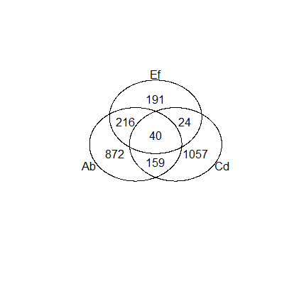
venn() will take a data frame as long as the values are booleans, so you can turn a data frame like this
Ab Cd Ef
1 TRUE FALSE FALSE
2 TRUE FALSE FALSE
3 TRUE TRUE FALSE
4 TRUE FALSE TRUE
5 TRUE FALSE TRUE
6 TRUE TRUE FALSE
...
Into this:
gplots provides just one of the available options. There's also the VennDiagram package and the venneuler package. The former of those packages offers extensive customization but doesn't handle the intersection counts itself. It may work well if the counts are already available. Here's an example:
venn.plot <- draw.triple.venn(
area1 = 40,
area2 = 33,
area3 = 70,
n12 = 10,
n23 = 10,
n13 = 7,
n123 = 3,
category = c("First", "Second", "Third"),
fill = c("blue", "red", "green"),
lty = "blank",
cex = 2,
cat.cex = 2,
)

The latter of those two packages, venneuler, makes the whole process so criminally easy that you could safely ignore gplots altogether. That is, unless you want the actual counts of each group plotted as above. That may be a job for post-R vector image editing but why do it by hand when you can automate it?
November 2015 update:
There's also the Vennerable package. It's described here and doesn't appear to be in CRAN but can be downloaded from R-Forge. Vennerable can handle all kinds of exotic n-group Venns, with a maximum n of nine.
Vennerable depends on graph, a package available through Bioconductor.
I haven't used it yet but will likely do so soon. Example output will show up here (further update: Vennerable also needs RBGL from Bioconductor. I ran into some unresolvable dependency issues while testing Vennerable so it will have to wait until I really need a nine group diagram, but that may indicate larger problems.)
February 2016 update:
Vennerable is now on Github. You'll need the devtools package to install it that way.
Vennerable has some neat features but lacks useful documentation. Here's a quick example.
Using the example data provided with the package, and cutting it down to just three groups:
data(StemCell)
VennRaw <- Venn(StemCell)
Venn3 <- VennRaw[, c("OCT4", "SOX2", "NANOG")]
plot(Venn3, doWeights = FALSE)
and that gives you the basic diagram.

If you use the full set of four groups, Vennerable defaults to overlapping rectangles, like this.

The type argument can be set to "circles", "squares", "triangles", or "AWFE" (that is, the kind of plot favored by British statistician AWF Edwards).
plot(VennRaw,type="AWFE")

Give Vennerable a try if you don't mind figuring out all the other options on your own or waiting for me to post about it again.