Waffling around: square pie charts in R
/Sometimes, when visualizing data, the most obvious conclusion is "some parts of this set are larger than others." It's tempting to use a pie chart for such a purpose, and why not? People like pie charts and I suspect these are the top reasons why:
1. Pie charts are obviously charts. It's easy to see a pie chart and immediately realize it's attempting to summarize some kind of data.
2. Pie charts lend themselves to pastry-based humor.
3. Pie charts are colorful by necessity. Many charts can be monochromatic but a pie chart without chromatically-unique slices is just a circle.
Otherwise, pie charts aren't too useful. They're difficult to parse and may even be inherently misleading. I won't rant about them here; other folks have done that for me in articles with titles like "The Worst Chart in the World" and "Pie Charts Are Bad".
Let's try an alternative strategy with the 'waffle' package in R. It makes waffle charts. These are essentially square pie charts, but instead of wedges of a circle, groups are represented by sets of squares (or even other shapes, if you want to get fancy).
There's some very helpful documentation and examples on its GitHub page. I'll try to go a bit beyond those examples here but I'll also assume you're an R novice.
You'll need ggplot2 so install it if you haven't already, then install waffle:
install.packages("ggplot2")
install.packages("waffle")
library(ggplot2)
library(waffle)
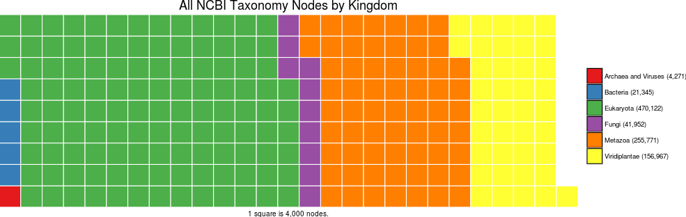
Now let's set up some example data - in this case, counts of the nodes in the NCBI Taxonomy database.
tax_count <- c(`Archaea and Viruses (4,271)`= 4271, `Bacteria (21,345)`= 21345, `Eukaryota (470,122)`= 470122, `Fungi (41,952)`= 41952, `Metazoa (255,771)`= 255771, `Viridiplantae (156,967)`= 156967)
(I've combined Archaea and Viruses here as their individual counts are much smaller than the others.)
Now let's waffle:
waffle(tax_count/1000, rows=20, size=0.5, colors=c("#cc0000", "#ff9900", "#ff6699", "#6699ff", "#006666", "#33cc33"), title="All NCBI Taxonomy Nodes by Kingdom", xlab="1 square is 1,000 nodes.")

We have a colorful waffle now and can play around with the colors some more with RColorBrewer:
install.packages("RColorBrewer")
library(RColorBrewer)
waffle(tax_count/1000, rows=20, size=0.5, colors=brewer.pal(6,"Set1"), title="All NCBI Taxonomy Nodes by Kingdom", xlab="1 square is 1,000 nodes.")

We can also compress this waffle:
waffle(tax_count/4000, rows=9, size=0.5, colors=brewer.pal(6,"Set1"), title="All NCBI Taxonomy Nodes by Kingdom", xlab="1 square is 4,000 nodes.")
Let's resize some of that text. This is a ggplot2 object, so ggplot2 options apply.
waffle(tax_count/4000, rows=9, size=0.5, colors=brewer.pal(6,"Set1"), title="All NCBI Taxonomy Nodes by Kingdom", xlab="1 square is 4,000 nodes.") + theme(axis.title.x=element_text(size = 16), text = element_text(size = 16))

There's also the option to use glyphs instead of squares by using the FontAwesome set. The extrafont package enables non-standard fonts to be used but you'll likely have to make it aware of the FontAwesome file as well.
install.packages("extrafont")
library(extrafont)

fa <- tempfile(fileext = ".ttf")
download.file("http://maxcdn.bootstrapcdn.com/font-awesome/4.3.0/fonts/fontawesome-webfont.ttf?v=4.3.0",
destfile = fa, method = "curl")
font_import(paths = dirname(fa), prompt = FALSE)
Use fa_list() to see the glyph options. Here's one with stars - note that I changed the row number to avoid overlap:
waffle(tax_count/4000, rows=12, size=0.5, colors=brewer.pal(6,"Set1"), title="All NCBI Taxonomy Nodes by Kingdom", xlab="1 square is 4,000 nodes.", use_glyph="star") + theme(axis.title.x=element_text(size = 16), text = element_text(size = 16))

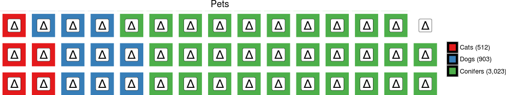
Here's another example with some different data for the sake of variety:
pet_count <- c(`Cats (512)`= 512, `Dogs (903)`= 903, `Conifers (3,023)`= 3023)
waffle(pet_count/100, rows=3, size=0.5, colors=brewer.pal(3,"Set1"), title="Pets") + theme(text = element_text(size = 16)) + geom_label(label="100", size = 3)

There's an extra label on the empty square, unfortunately. This may not be a problem for you.
We can use geom_text to use Unicode characters as glyphs, too:
waffle(pet_count/100, rows=3, size=5.5, colors=brewer.pal(3,"Set1"), title="Pets") + theme(text = element_text(size = 16)) + geom_label(label=sprintf("\u0394"), size = 8)
The waffle package isn't the only option for waffle plots. It's one of the easiest to use, though, especially if you're already familiar with ggplot.
I've tried out Ruben Arslan's formr package for waffle plots as well. It produces plots like this:
pets_list <- c(rep("Cats", 5), rep("Dogs", 9), rep("Conifers", 30)) qplot_waffle_tile(pets_list) + theme(text = element_text(size = 28))
