Limitless Powerpoint: alternatives to the usual slide presentations
/I’ve had a fair amount of musing/complaining about posters here lately, but what about the ubiquitous PowerPoint-style slide presentation? It’s just as much a linga franca of scientific communication as anything else, despite being conceptually identical to overhead transparencies of old. I’m not going to get into the inherent limitations of slide presentations, especially now that we’ve progressed beyond the age of laser sound effects and transitions. These discussions have been conveyed elsewhere, years ago. I believe much of the argument comes down to “the focus of the presentation should be the presenter, not the slides”. It’s certainly a compelling position but not one I’m going to dissect at the moment.
Instead, let’s look at a few alternatives to PowerPoint and its ilk. These are tools for in-person talks or webinars, as opposed to pre-recorded presentations. They seem to primarily address one of PowerPoint’s primary limitations: it never satisfactorily engineered a way to integrate all the types of audiovisual media a presenter may want to show. The standard protocol for demonstrating a live web site, for instance, is to open it in a browser. Google Slides gets better all the time but has similar limitations. Keynote and LibreOffice Impress still follow the same PowerPoint philosophy. How about something entirely new? A new paradigm, perhaps? Or maybe you just want to include small animations, like in this acknowledgements slide? Here are a few.
Ludus
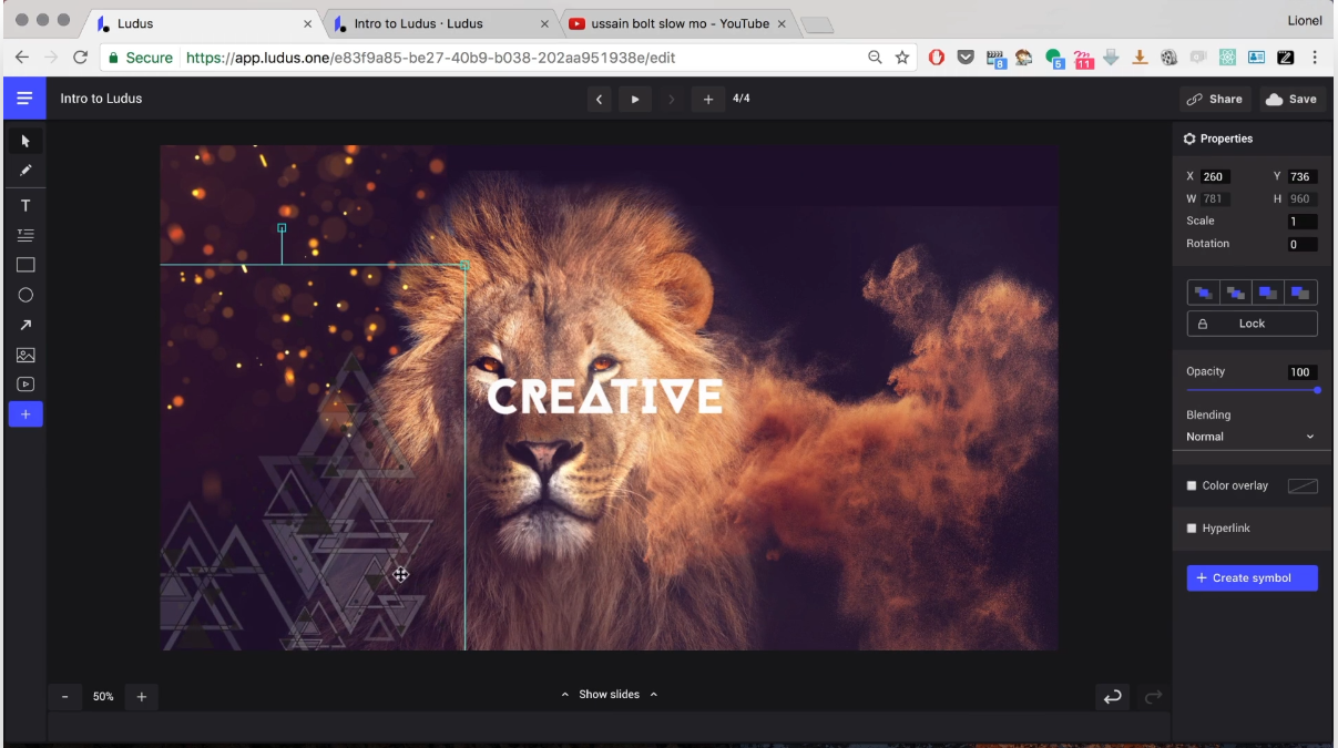
A slide tool built around “smart blocks” and integration with a whole bunch of webservices. Want to add GIFs on a whim? Have a collection of design mockups on Figma you’d like to show off? Ludus will do both of those. Plus, their About page does, in fact, refer to the tool as a “new paradigm”. It does most of the things PowerPoint et al. do, though it costs about $15 to $20/month for a single user, depending on payment frequency. I have not tried it and likely will not in the future for this reason (the above image is captured from the demo video on their site). There is a 30 day free trial if you are intrigued. Its targeted audience seems to be designers rather than researchers. The integrated services don’t seem to align with the usual science needs: support for things like Dropbox may help if that’s part of an existing workflow, but there isn’t integration with NCBI resources or arXiv, for example. Looks neat otherwise.
Prezi
So much of a counterpoint to Ludus that it bills itself as “for people who aren’t designers”, Prezi is built around zooming in and out on a map of visuals. The platform has been around for about a decade now and has had plenty of time to smooth out its rough edges, though the interface still requires some acclimation. A big plus: it has a fairly basic but free-of-any-monetary-cost option. The cheapest paid option is $7/month. Prezi’s new interface makes all the style details easy to play around with. But does Prezi meet the needs of research presentations? Does it make it easier to convey multifaceted questions, methods, and results? Here’s one example of something Prezi does very well: it allows the presentation to zoom in on detailed figures without having them continuously occupy a lot of screen space. This is another fun example. I think the zoom effects need to be handled with care, as they can become distracting as the view zooms past other slides. It can feel a bit like trying to navigate with Google Maps in an area you don’t know well. If you don’t think your audience will mind, Prezi may be worthwhile, but expect to feel constrained by the free account limitations.
Swipe
This option is a bit closer to traditional slide presentations, with a few notable features. Swipe supports building slides out of pure Markdown notation, a format many programmers and Github devotees are familiar with. It’s a great way to control formatting without getting too distracted by the exact placing of every text box or visual element. Swipe also allows presentations to include multiple choice polls. This seems entirely appropriate for academic lectures, and given the right setup, could even be a simple way to increase audience engagement. The audience would have to be expecting it from the beginning but it appears quite easy to direct them to a short link providing the live presentation, complete with polls and real-time results. This is my favorite of the three, and the option I’m most likely to use in the future, particularly as it has a decent free option.
This is just a selection of the non-PowerPoint presentation platforms in existence. In the end, there’s no replacement for delivering a message confidently and authentically, except perhaps for getting on a stage and screaming for 20 to 30 minutes. That can go pretty far, too.


