Annotation and conversion with brat: a technical note

Quick technical fix if you’re interested in trying out some of the tools developed for use with the brat annotation platform. I wanted to be able to convert brat annotations into BioC format. There’s a tool developed by Antonio Jimeno Yepes et al. for that purpose - it’s called Brat2BioC. This tool has the dependency of brateval, developed by the same group. I tried installing brateval first via maven as instructed, and it built just fine, but Brat2BioC refused to do so.

Image not explicitly related.

Image not explicitly related.

The solution? Turns out Brat2BioC is just looking for the wrong version of brateval. Edit pom.xml such that the line

<version>0.0.1-SNAPSHOT</version>

under

<artifactId>BRATEval</artifactId>

matches the actual version name of the brateval jar file. Then the build should work.

But what about running the thing? I have a set of annotated documents in brat standoff format (i.e., I have a set of .txt docs and corresponding .ann files) now in their own folder named “input”. After at least an hour of troubleshooting I still couldn’t get it to work. Part of the issue is Maven: it doesn’t seem to like loading local jar packages anymore (see this Stackoverflow post). Even avoiding Maven doesn’t seem to help, though. Java can just never seem to find the main class, which could happen for a variety of reasons, but in this case it just needed some very explicit CLASSPATH definitions. Having built BRATEval already as requested by the Brat2BioC README, I copied its jar into the Brat2BioC lib folder, then ran the following:

java -cp ./target/classes:BRAT2BioCConverter-0.0.1-SNAPSHOT.jar:./lib/BRATEval-0.1.0-SNAPSHOT.jar:./lib/bioc.jar:xstream-1.4.4.jar:xmpull-1.1.3.1.jar:xpp3_min-1.1.4c.jar au.com.nicta.csp.bbc.BRAT2BioC input output

This works just fine.

Lessons learned: even relatively simple format-conversion tools can be a headache to get working if you have to troubleshoot things like file locations.

ME, ME, ME: mutual exclusivity in understanding biomedical text

I’ve been reading and thinking about this paper by Gandhi and Lake on mutual exclusivity bias, or ME bias, lately, especially in terms of what it means for understanding biomedical text and other communications. ME bias is the tendency for an individual or a model, given a set of objects with known names along with an unknown name and novel object, to assign the new name to the new object. This bias works under the assumption that every object has one name. If that seems childlike, you’re right: this is one of the biases used by children when they’re learning language. They don’t often grasp the complexity of hierarchical relationships while they’re still learning, but if you show them a novel object, they’ll readily attach a newly provided name to it.

What kind of bird is that? I’ve seen birds before, and could even tell you the species of some types of birds, but I couldn’t tell you what the species of this one is. If you told me it was a Green Violetear I would have no evidence to dispute the i…

What kind of bird is that? I’ve seen birds before, and could even tell you the species of some types of birds, but I couldn’t tell you what the species of this one is. If you told me it was a Green Violetear I would have no evidence to dispute the identification. Maybe it’s enough to just call it “bird”. Image credit: me.

Gandhi and Lake were curious about whether neural networks (NNs) operate using the same bias. It would be convenient if they did, not only because it would allow them to learn relationships in a way mirroring that of humans, but because the data they may need to learn from if often replete with infrequently-occurring concepts. This is, in fact, a known limitation of NNs. They often encounter difficulties in assigning meaning to objects or sequences when few or zero training examples are available. The authors refer to recent work by Cohn-Gordon and Goodman demonstrating how machine translation models often produce ambiguity through many-to-one semantic relationships (i.e., two sentences in a given language may be translated to the same output sentence, even if those two sentences have different meanings) but implementing a model incorporating a bias resembling ME can preserve more of those direct, meaningful relationships.

Through experiments with synthetic data, the authors show that:

  • None of 400 different varieties of NN classification model demonstrate ME bias. In fact, they default to the opposite bias: “…trained models strongly predict that a novel input symbol will correspond to a known rather than unknown output symbol”.

  • This anti-ME bias holds regardless of the size of the training data.

  • The same appears to be true for sequence-to-sequence models: “The networks achieve a perfect score on the training set, but cannot extrapolate the one-to-one mappings to unseen symbols”.

This tendency may be true for machine learning models of other architectures and not NNs alone, as the authors concede. They extensively discuss how including ME bias may improve applications of machine translation and image classification, with the caveat that continuing the metaphor of human-style learning may be untenable in machine learning. As humans, we need mechanisms to learn about novel phenomena for our entire lives, so we remain open to the idea that a newly-encountered word or object may have a new meaning or name. Training machine learning models requires some degree of artificial limitation, however. It does provide a level of control over learning that few actively learning children will ever experience (and, on the subject of active learning, children receive constant feedback from parents, teachers, and their environment; it’s challenging to give any machine model that amount of careful human guidance).

So what’s the relevance to understanding biomedical text? One of the challenges in understanding any experimental or clinical document is its vocabulary. We can expect that some words in the document will be novel due to some combination of not encountering them before, learning them in a different context (and perhaps even one with a slightly different meaning, like how a myocardial infarction and a cerebral infarction are physiologically similar but certainly not identical, not least of which because they’re in different organs), or authorial creativity. Here’s a recent paper with a novel title: “Barbie-cueing weight perception”. As a reader, I can parse that pun on “barbecue”, and that’s not even technical terminology. What would, say, a biomedical named entity recognition model do with it? I don’t think ME bias can solve pun recognition, but could it assist with recognizing when a term is genuinely new and meaningful?

Results by Gandhi and Lake suggest that, at least for machine translation models, a novel output should be expected given a novel input. In entity recognition, it’s trivial to have this expectation, but perhaps not useful to assume that all novel words or phrases are unique entities. Typing is the real challenge, especially if there are numerous possible types. Should all newly encountered words get added to new types, then processed further in some manner? Perhaps this would make the most sense in a continuous learning scenario where types are aligned to a fixed ontology but there is some room for ambiguity. I’m not sure if it’s quite the same as ME bias to have a bias toward ambiguity, but it seems like half of the idea. There’s likely some of the idea of learning to learn involved. A model would need to have some ability to recognize contexts appropriate for assigning new or ambiguous relationships, much like how children learn about being prompted to connect a new object with a name.

Limitless Powerpoint: alternatives to the usual slide presentations

I’ve had a fair amount of musing/complaining about posters here lately, but what about the ubiquitous PowerPoint-style slide presentation? It’s just as much a linga franca of scientific communication as anything else, despite being conceptually identical to overhead transparencies of old. I’m not going to get into the inherent limitations of slide presentations, especially now that we’ve progressed beyond the age of laser sound effects and transitions. These discussions have been conveyed elsewhere, years ago. I believe much of the argument comes down to “the focus of the presentation should be the presenter, not the slides”. It’s certainly a compelling position but not one I’m going to dissect at the moment.

Instead, let’s look at a few alternatives to PowerPoint and its ilk. These are tools for in-person talks or webinars, as opposed to pre-recorded presentations. They seem to primarily address one of PowerPoint’s primary limitations: it never satisfactorily engineered a way to integrate all the types of audiovisual media a presenter may want to show. The standard protocol for demonstrating a live web site, for instance, is to open it in a browser. Google Slides gets better all the time but has similar limitations. Keynote and LibreOffice Impress still follow the same PowerPoint philosophy. How about something entirely new? A new paradigm, perhaps? Or maybe you just want to include small animations, like in this acknowledgements slide? Here are a few.

Ludus

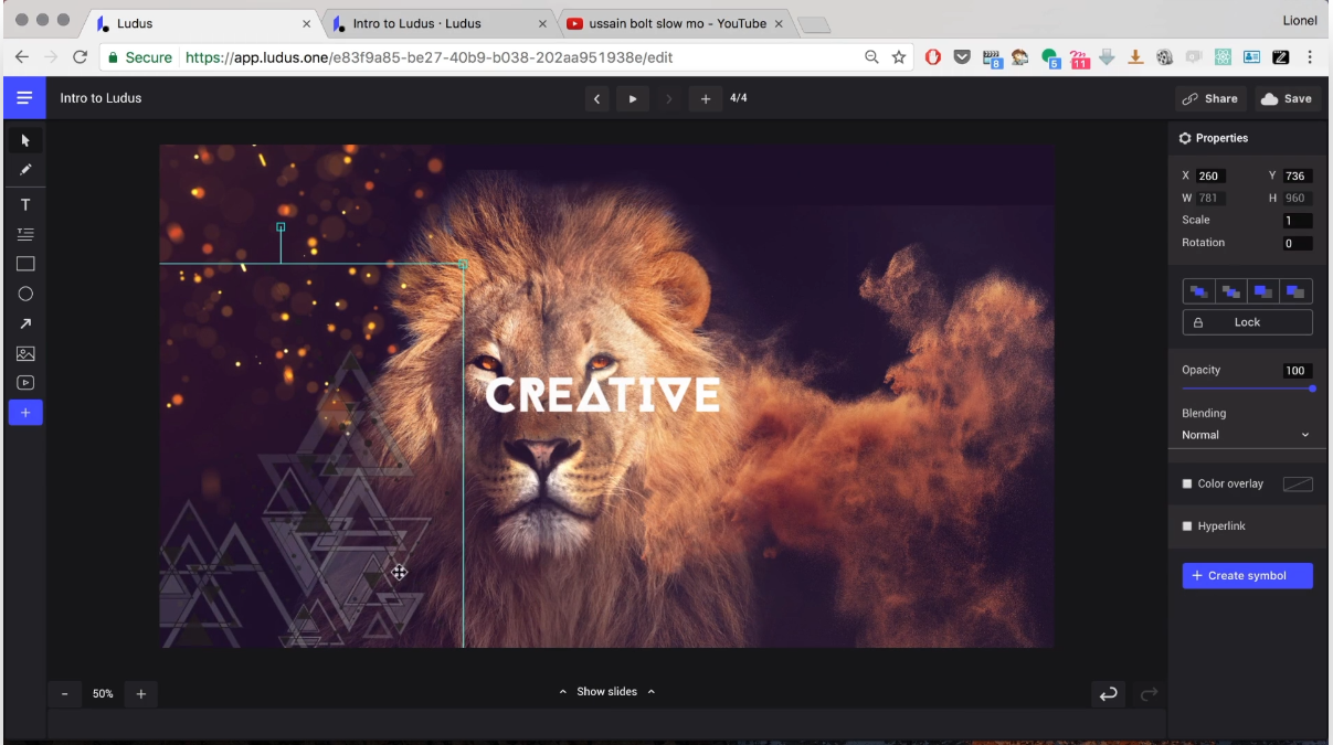
Ludus-example.png

A slide tool built around “smart blocks” and integration with a whole bunch of webservices. Want to add GIFs on a whim? Have a collection of design mockups on Figma you’d like to show off? Ludus will do both of those. Plus, their About page does, in fact, refer to the tool as a “new paradigm”. It does most of the things PowerPoint et al. do, though it costs about $15 to $20/month for a single user, depending on payment frequency. I have not tried it and likely will not in the future for this reason (the above image is captured from the demo video on their site). There is a 30 day free trial if you are intrigued. Its targeted audience seems to be designers rather than researchers. The integrated services don’t seem to align with the usual science needs: support for things like Dropbox may help if that’s part of an existing workflow, but there isn’t integration with NCBI resources or arXiv, for example. Looks neat otherwise.

Prezi

prezi-example.png

So much of a counterpoint to Ludus that it bills itself as “for people who aren’t designers”, Prezi is built around zooming in and out on a map of visuals. The platform has been around for about a decade now and has had plenty of time to smooth out its rough edges, though the interface still requires some acclimation. A big plus: it has a fairly basic but free-of-any-monetary-cost option. The cheapest paid option is $7/month. Prezi’s new interface makes all the style details easy to play around with. But does Prezi meet the needs of research presentations? Does it make it easier to convey multifaceted questions, methods, and results? Here’s one example of something Prezi does very well: it allows the presentation to zoom in on detailed figures without having them continuously occupy a lot of screen space. This is another fun example. I think the zoom effects need to be handled with care, as they can become distracting as the view zooms past other slides. It can feel a bit like trying to navigate with Google Maps in an area you don’t know well. If you don’t think your audience will mind, Prezi may be worthwhile, but expect to feel constrained by the free account limitations.

Swipe

swipe-example.png

This option is a bit closer to traditional slide presentations, with a few notable features. Swipe supports building slides out of pure Markdown notation, a format many programmers and Github devotees are familiar with. It’s a great way to control formatting without getting too distracted by the exact placing of every text box or visual element. Swipe also allows presentations to include multiple choice polls. This seems entirely appropriate for academic lectures, and given the right setup, could even be a simple way to increase audience engagement. The audience would have to be expecting it from the beginning but it appears quite easy to direct them to a short link providing the live presentation, complete with polls and real-time results. This is my favorite of the three, and the option I’m most likely to use in the future, particularly as it has a decent free option.

This is just a selection of the non-PowerPoint presentation platforms in existence. In the end, there’s no replacement for delivering a message confidently and authentically, except perhaps for getting on a stage and screaming for 20 to 30 minutes. That can go pretty far, too.

More thoughts on alternative posters and alternatives in general

I’ve seen some pushback on Twitter lately (one example here, but there are certainly others) regarding the idea of alternative posters. Some of it seems to be directed at the simplified poster design template that’s been going around lately (that is, the one I have an example of in the previous post). The critics claim it has too much negative space, it doesn’t focus on the data supporting claims, or that it just looks ugly. It’s clear that much of the criticism is about that specific poster design, and not about the idea of alternative scientific communication itself, but the complaints highlight a few general difficulties which continue to be pervasive in academia and scholarly interactions.

Pictured: how I feel at most poster sessions, including the sensation of trying to look though the back of someone’s head

Pictured: how I feel at most poster sessions, including the sensation of trying to look though the back of someone’s head

  1. Audiences and expectations are changing. If you work in a particular field, e.g. environmental chemistry, you likely collaborate with people in that field most of the time. You see them at the same few meetings you usually attend. You all publish findings in the same collection of publications, and you know or at least recognize their editorial staff members. You have established explicit or implicit standards in your field, such as the minimum amount or quality of evidence needed to support a conclusion. You know which kinds of experiments should be done to answer a given question. You want to see certain kinds of results, down to specific figure and visualization types. In short, you have a set of well-established expectations about How Science Is Done.

    This all becomes a challenge as projects become larger and more interdisciplinary. Researchers exposed to a new field likely don’t have the pre-conceived expectations of someone who has been in that field for the last decade or so. When communicating findings, their goal is less of “here is how I prove my hypothesis, which we already know is relevant, why would you even question the relevance of our field, let’s not get into why what we do is valid” and more of “yes, my findings are relevant to you, yes, this is a real field and people get paid to do it, of course it may impact your work too, please don’t walk away, come back, come back, I know this figure looks complicated but I can help to explain it, give me a chance”. Effective communication in interdisciplinary scenarios needs to address high-level questions. That takes a lot of effort! I think the most appropriate solution is to save most of the intricate data analyses and visualizations for settings where audiences can absorb them at their own pace (like papers, handouts, web pages, videos, apps, or pretty much anything other than a poster).

  2. Researchers wear many hats. I wish there was a better metaphor for this, since “hats” implies different roles, like how putting on a cowboy hat makes you a cowboy. Perhaps it’s more like bumper stickers on an old Volvo or patches on a punk’s denim jacket. Everyone working in any facet of science — but particularly folks in academia — are expected to have bits and pieces of varied skills, many of which they pick up organically or through self-teaching. They need to learn effective public speaking, management, accounting, and graphic design, in degrees often depending on how many people they work with who have developed those skills already (e.g., a student may join a lab in which a postdoc is dead-set on making all the figures, or they may work in a field with few opportunities for giving talks). Some of these issues, like the tendency for investigators to lack formal management training before beginning a lab, are well-recognized and may have a few solid solutions. Others, like the expectation that researchers will just figure out how to produce effective illustrations and figures, are baked into academic culture, I suspect.

    So what does this have to do with posters? I believe posters are the best example of the compromise between acquiring an in-depth knowledge of the skills necessary for truly impactful communication of novel findings and ideas (primarily marketing, graphic design, and editing) and obtaining skills and knowledge in a specific scientific field. Posters aren’t terribly good media for presenting ideas, they’re just good enough. They’re simple, they’re not overly dissimilar from published papers or books, and you can put a whole mess of them in a convention center without violating many fire codes.

  3. There’s just too much to read. This issue has to do with expectations, again, namely the expectation that any single researcher has a comprehensive understanding of the state of the field. This may be possible if you define a field in a very narrow way, like “only papers by my friends or their advisors, published in these three journals, and even then only if I’m looking for citations for a review I’m writing”. I just don’t think it’s possible otherwise. Obviously it’s not practical to read every paper in most fields or even every poster abstract for the larger conferences (i.e., those with more than 5,000 attendees or so), but even staying aware of recent developments is a full-time job. The strategy of following established leaders in the field can help but risks ignoring the work by those without a major following yet (and, crucially, minority voices who already have to deal with the systemic tendency to devote attention to people who resemble folks in the field, often white men).

    This may be a situation in which posters just add to the noise. I don’t have a decent solution here, and strategies to make posters more eye-catching and noticeable address a different problem entirely. Perhaps posters are another area where a more structured product would be helpful: if I could reliably pull them en masse into some kind of poster aggregator, at least they would be easier to browse. I still suspect that many findings would be more appropriately delivered through other media.

More alternative posters: the poster as billboard

Relevant to the subject of my previous post, Mike Morrison, a PhD student at Michigan State University, recently shared a lil’ animated guide and some templates about how to design better posters. I think the quick graphical summary really shows what he’s going for:

billboardstyle-template-final.png

The focus is no longer on how much of a full paper you can cram onto a limited space, but how rapidly you can deliver your central finding(s) to an audience of highly-distracted session attendees. Check out the Powerpoint templates as well - he’s included some suggestions on high-contrast color schemes and some other design details. I’ll definitely implement some of these ideas in my next poster.