Heatmaps in R, two ways
/I'm going to get into the code as soon as possible here, but just so we're clear about one thing: a heatmap is just a matrix visualized with color gradients. Most of the time, looking at an entire matrix of data is overwhelming, especially if there isn't an obvious pattern to the data. A heatmap won't necessarily render that matrix less confusing but it can leverage our much-lauded human pattern-recognition abilities to see similarities among groups.
With R, there are quick ways to make heatmaps and there are tedious but finely-tuned ways. I'll demonstrate two of the latter type.
Let's assemble some example data first. We want a large set where every value is on the same scale (i.e., between -1 and 1).
randup <- data.frame(group1 = rnorm(2500,mean=0.5,sd=0.1), group2 = rnorm(2500,mean=0.5,sd=0.2), group3 = rnorm(2500,mean=0.5,sd=0.15), group4 = rnorm(2500,mean=0.2,sd=0.11))
Using randomly-generated data is useful but avoids a few concerns, so I'll address them here:
- You may need the rows or columns of your heatmap to follow a specific order, i.e. a taxonomy. Most heatmap methods will, by default, perform hierarchical clustering.
- If your data contains entries which aren't in your specified order, load the list of identifiers and match them doing something like this, where wantedlist contains the IDs you want in the order you want them, assuming those IDs should match those in the first column of your data frame:
want_ids <- wantedlist$V1
your_new_data <- your_data_frame[match(want_ids, your_data_frame$V1),]
Unmatching IDs, if any, will get labeled as NA. You can remove them with complete.cases as follows:
your_new_data <- your_new_data[complete.cases(your_new_data),]
Or, enforce uniqueness with something like
rownames(your_new_data) = make.names(your_new_data$X, unique=TRUE)
Differences in the two lists (that is, the IDs you want and the IDs you have in the data frame) can be checked with setdiff().
Remember that you need to check in two directions, or
setdiff(a,b)
setdiff(b,a)
Removing offending IDs from the list may mean that other graphical elements, like trees, will need to be rebuilt. NA values in the data may also create empty spaces in the heatmap, so you can set them all to zero:
your_new_data[is.na(your_new_data)] <- 0
Then they'll still be empty but the correct color, at least.
Finally, ensure that your IDs are actually being used as IDs and not values in the data frame.
row.names(your_new_data) <- your_new_data$V1
your_new_data <- your_new_data[,-1]
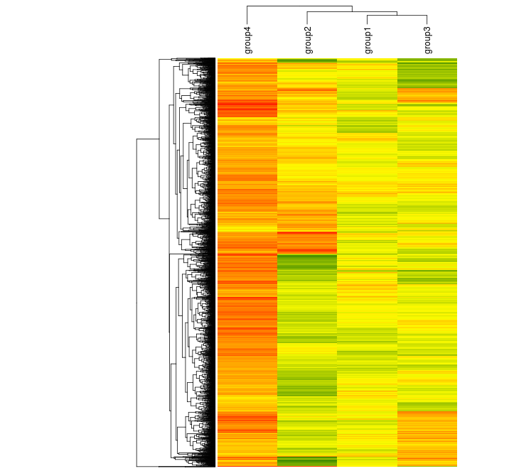
OK, let's start making some maps. The first example uses the packages vegan and gplots (heatmap.2, specifically) so make sure they're installed and loaded first. We'll cluster rows and will start by converting to a matrix.
randup.m <- as.matrix(randup)
scaleRYG <- colorRampPalette(c("red","yellow","darkgreen"), space = "rgb")(30)
data.dist <-vegdist(randup.m, method = "euclidean")
row.clus <-hclust(data.dist, "aver")

heatmap.2(randup.m, Rowv = as.dendrogram(row.clus), dendrogram = "row", col=scaleRYG, margins = c(7,10), density.info = "none", trace = "none", lhei = c(2,6), colsep = 1:3, sepcolor = "black", sepwidth =c(0.001,0.0001), xlab = "Identifier", ylab = "Rows")

By default, heatmap.2 includes a color key, row labels, and a row dendrogram. The white line in the middle here is a resizing artifact but may also show up if you have NAs in your data. We can omit both of the dendrograms by setting dendrogram to "none" and can ignore our clustering by setting both Rowv and Colv to FALSE. We essentially get a raw heatmap that way:

Note that vegdist and hclust both offer different methods to try. Note also that hclust works on rows, so if you want distances between columns, transpose the matrix using t() when clustering (here, where we assign a value to row.clus).
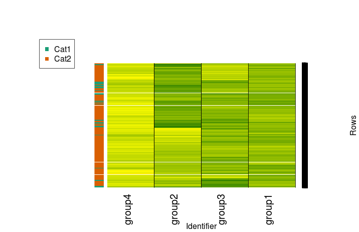
Now, let's imagine we have some kind of categorical variables for our data. We'll put everything with an average of at least 0.5 across all groups in Cat 1 and everything else in Cat 2. Generate those labels as follows:
randmeans <- rowMeans(randup)
randup$rowmean <- randmeans
randup$cat <- ifelse(randup$rowmean>0.5, "Cat1","Cat2")
randup$rowmean <- NULL
Install and load the RColorBrewer package as well.
Now let's make it:
mycol <- brewer.pal(3, "Dark2")

f <- factor(randup$cat)
test.d <- as.dendrogram(row.clus)

heatmap.2(randup.m, Rowv = test.d, dendrogram = "none", col=scaleRYG, margins = c(7,10), density.info = "none", trace = "none", colsep = 1:3, sepcolor = "black", sepwidth =c(0.001,0.0001), xlab = "Identifier", ylab = "Rows", RowSideColors=mycol[f], key = FALSE)

legend(x="topleft", legend=levels(f), col=mycol[factor(levels(f))], pch=15)
Or, in a more minimal and more appropriately stretched fashion:
heatmap.2(randup.m, Rowv = test.d, dendrogram = "none", col=scaleRYG, density.info = "none", trace = "none", colsep = 1:3, sepcolor = "black", sepwidth =c(0.001,0.0001), RowSideColors=mycol[f], key = FALSE, labRow = "", cexCol=1.25)

But that's just one way to make a heatmap! The heatmap.2 function has been around for years. Is there a newer option we can use just for the sake of using the newest option? Even better, is there an option that will do most of the work for us?
Try out the ComplexHeatmap package through Bioconductor. This will require you to install Bioconductor if you don't have it already - see this page for details. The package has some nice, extensive documentation.
Once you're ready, install and load ComplexHeatmap, then provide it with our matrix.
source("https://bioconductor.org/biocLite.R")
biocLite("ComplexHeatmap")
library("ComplexHeatmap")
Heatmap(randup.m, col = scaleRYG, name = "Value", cluster_rows = FALSE, cluster_columns = FALSE)

ComplexHeatmap handles color scales differently than heatmap.2 does, so you'll notice that there's more red here. The lower end of the scale has been set at -0.5. We get a more informative range of colors in the process. We can still produce a similar range if we wish:
library(circlize)

Heatmap(randup.m, name = "Value", cluster_rows = FALSE, cluster_columns = FALSE, col = colorRamp2(c(-1, 0, 1), c("red", "yellow", "darkgreen")))

We can cluster it, too, but this time we can more easily rearrange positions of elements like labels.
Heatmap(randup.m, col = scaleRYG, name = "Value", clustering_distance_rows = "euclidean", clustering_method_rows = "aver", column_names_side = "top", width = unit(16,"cm"), row_dend_width = unit(4, "cm"), show_heatmap_legend = FALSE)
The ComplexHeatmap documentation provides detailed examples, including those with a variety of different annotation styles. It provides many of the features I've had to fight with gplots to get thus far.
In case you need other options, here are a few more ways to construct heatmaps in R:
- The aheatmap function in the NMF package.
- pheatmap - it's what aheatmap is based on. There's an example here.
- Plotly (or, er, plot_ly) will do it but I'm not sure how customizable the results are.
Happy mapping!